THE BRIEF
Calma came to BWM with a product, a category, and no brand. The product: a self-heating eye mask that warms to 104°F when exposed to air — no microwave, no plug, no setup. The category: a fast-growing corner of the wellness market built on a real and documented consumer problem. The brief: build everything else.
Over 80% of American adults experience digital eye strain. The average adult now spends more than two hours daily in front of screens — for most working professionals it’s significantly more. The self-heating eye mask market exists because of this, and it’s growing accordingly. What it doesn’t always have is branding that matches the quality of the need.
WHAT BWM BUILT
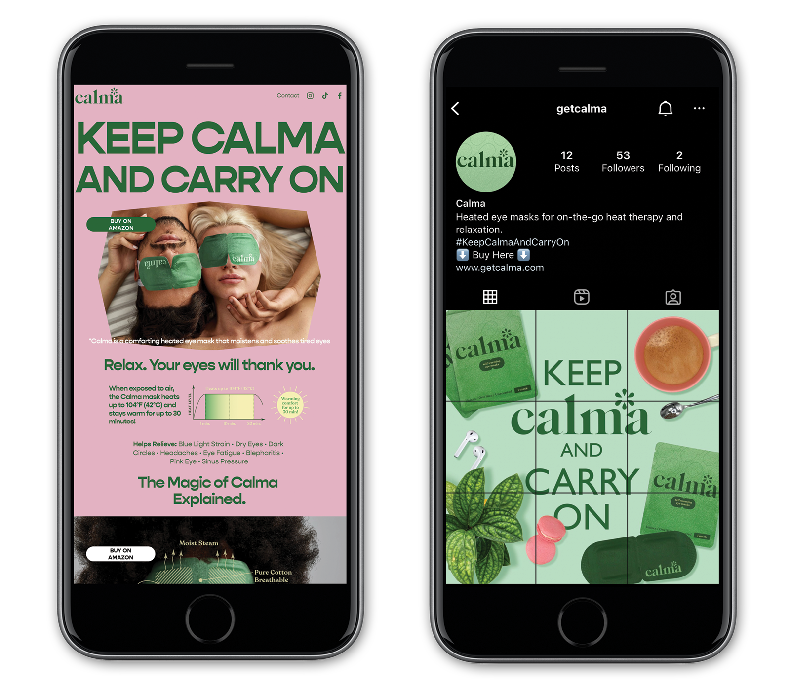
BWM created Calma’s complete brand identity from the ground up: name-era visual identity, packaging design, website, and social media design and strategy. Every element of how Calma presents itself to the world was designed here.
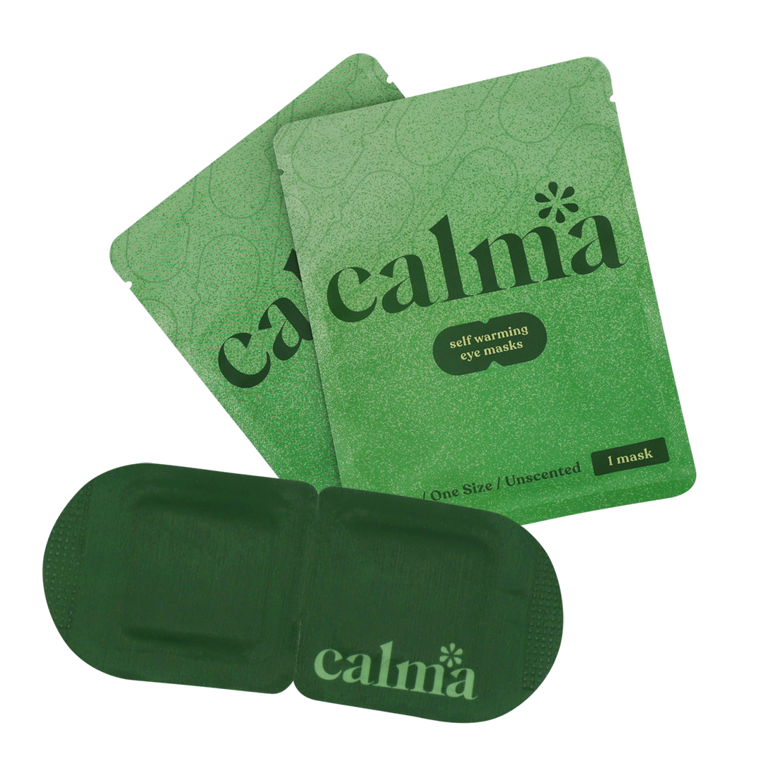
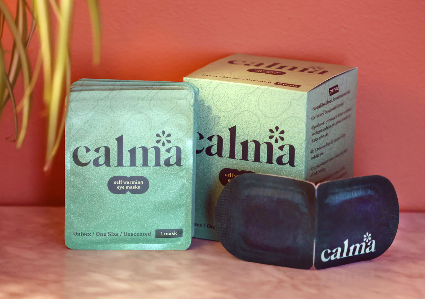
The packaging anchors the system. Calma’s soft mint green — chosen to signal calm without saying it — gives the product immediate shelf presence in a category crowded with clinical white and pharmaceutical blue. A clean modern serif carries the brand name with confidence. Whitespace does the work that copy can’t. A small asterisk detail at the brand mark gives Calma something competitors don’t have: a visual signature you’d recognize without reading a word. The individual packets are designed to slip into a bag, a desk drawer, a carry-on — because the product only works if people have it with them.
The unscented, unisex formulation was a deliberate market decision, broadening Calma’s potential consumer well beyond the lavender-and-female-coded defaults of most eye care self-care products. The packaging reflects that choice: approachable for anyone, specific to no one.
THE RECOGNITION
Calma’s packaging was selected as Best of Packaging Design by DesignRush — a jury-reviewed program that evaluates design against real criteria: shelf differentiation, brand coherence, functional logic, and consumer communication. The editorial analysis cited the mint-green palette, the serif typeface, the minimalist layout, and the asterisk specifically. When a design publication names specific decisions, it means the design is doing something intentional — and that the intention landed.
WHY THIS PROJECT MATTERS FOR BWM
Calma is the kind of project that demonstrates what a full-service agency is actually for. Any designer can make a label look good. Building a brand from zero — identity, packaging, digital presence, social strategy — in a competitive category, for a product with no existing consumer recognition, requires strategic thinking alongside creative execution. BWM delivered both, and the result is a brand that earned independent critical recognition before most consumers had ever seen it on a shelf.
![]()